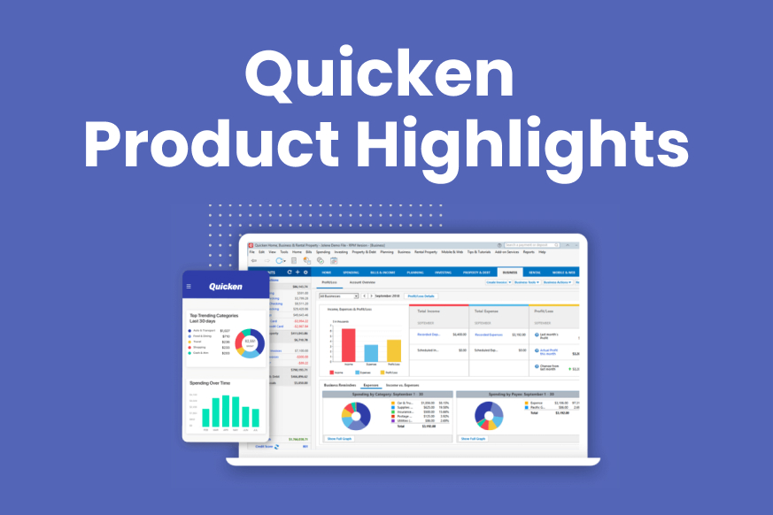
With Release R35, coming out in early September, The Quicken for Windows team is proud to announce a new Home tab dashboard. The Home tab has always been the place to see an overview of your finances, and the new dashboard gives you an improved look with more information and analysis.
One of the great features of the new dashboard is that you can change the order of the snapshots just by dragging and dropping. Click and hold your pointer on a snapshot, then drag it to where you want it to appear. The rest of the cards will reorder to adjust to the new location. This gives you control over the way Quicken looks and feels.
While we are proud of our new dashboard, we know how frustrating it can be when a major feature changes without warning. To keep the new dashboard from disrupting customer experience we are releasing the feature this way:
The new dashboard will appear automatically for new customers.
Existing customers can see the new dashboard by selecting the gear icon on your existing Home tab dashboard. You’ll have a choice between Classic and Modern.
Here are some of the snapshots you’ll see in the modern dashboard:
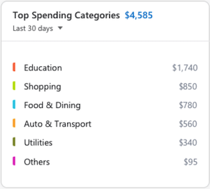
Top Spending Categories
The Top Spending Categories snapshot shows what categories you are spending your money in. The default view is for the last 30 days, but you can choose other time periods as well. You can hover your pointer over any category to see more information about your spending in that category.
Top Payees
The Top Payees snapshot shows you who you are giving money to. As with Top Spending Categories, you can adjust the date range to get a better idea of your spending over time. You can also hover your pointer over a payee to see how much money you have sent them, and what percentage of your total spending was given to that payee.
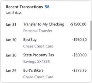
Recent Transactions
The Recent Transactions snapshot shows you what transactions you’ve made in the last three days. You can expand the time to include the last ten or twenty days. If you have many transactions, you can scroll through them on the snapshot. You can also hover your pointer over a transaction to get more details about the Account and Category.
Uncategorized
The Uncategorized snapshot is an excellent resource that you can use to assign categories to your transactions. You can review your transactions, as well as use the Categorize All button to start the process of categorizing your transactions.
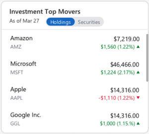
Investment Top Movers
For the customers who track investments in Quicken, the Investment Top Movers snapshot is the first of two snapshots that are specifically for investments. Investment Top Movers displays the securities that have changed the most in value that day. You can choose to view this either by security or by holding. You can also hover your pointer over a security to get more information.
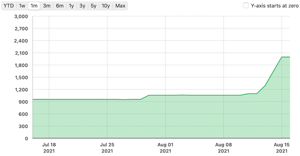
Portfolio Value
Also for the customers who track investments in Quicken, the Portfolio Value snapshot gives you a graph of the value of your holdings. You can use the date menu at the top of the snapshot to see how the sum of your holdings has changed over time. You can also hover over a point on the graph to see the value of your holdings on the corresponding date.
Quicken for Mac is improving your investing experience
The team at Quicken for Mac has been working hard to improve your investing experience in Quicken. With our 6.3 release, we’ve added options to your Portfolio page and added a brand-new Investing Dashboard to give you great information about your investments at a glance. You can select an account type (Investing, Brokerage, Retirement, or Education) to view snapshots of your investments across multiple accounts in a single category. This can help you determine if you are overweighted in a single security or asset class.
New options for your Portfolio View
For your Portfolio View, we’ve added more time frame options to make your chart more useful. You can now get one-week, one-month, three-month, and six-month views of your Portfolio Chart. This gives you a better way to see your portfolio’s performance over the short-term versus the longer-term chart options that we provided in the past. Of course, you still have the option of looking at your chart for YTD, one year, three years, and five years.
An exciting new Investing Dashboard
One of the features we have been looking to add to Quicken for Mac for a long time is an Investing Dashboard. This new feature helps you to get an overview of your investments with information about individual holdings, allocation, and what securities are gaining or losing on the day. We know how valuable information is to our customers, and we are working hard to give you more information in easy-to-read and interpret snapshots.
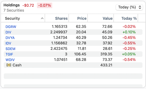
Holdings Snapshot
The Holdings snapshot gives you an overview of all the securities you own. This is a great place to see your investments at a glance. You can review the number of shares owned, the current price, and the overall value of your holdings. You can use the menu at the top of the snapshot to choose between showing today’s gain or loss by percentage or today’s gain or loss by value. You can also sort by any column and view how much cash you have in your brokerage account. Additionally, you can click on any security name to view or edit that individual security.
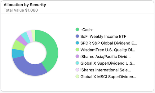
Allocation by Security Snapshot
The Allocation by Security Snapshot provides you with a look at what holdings make up your portfolio by amount. The Allocation by Security graph is an excellent visual guide to what investments you have put your money into and helps you to assess the risk level of your investments. If you click individual securities, either on the legend or the graph, you will see additional information about that security, including the number of shares, rounded dollar value, and the percentage of your holdings that security represents.
Top Movers Snapshot
The Top Movers Snapshot gives you a look at how your securities are performing on the day. If you keep track of the daily changes in the market, this is a handy glimpse at your stock’s performance, tracking the change both in percentage and price. The menus at the top of the snapshot let you narrow the list to just Gainers or just Losers, and to list by By Holding or By Security. Click a security name to Edit or View that security.
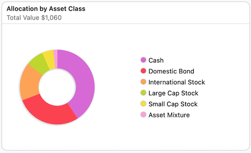
Allocation by Asset Class
The Allocation by Asset Class Snapshot gives you an overview of your investments that is focused on the types of securities you have invested in. This is useful for determining if your investments are allocated in the areas you most want to invest in. To get more information, click on an asset class, either in the graph or the legend, and you will see the percentage of your investments in that asset class, as well as the monetary value rounded to the dollar.
Quicken has made the material on this blog available for informational purposes only. Use of this website constitutes agreement to our Terms of Use and Privacy Policy. Quicken does not offer advisory or brokerage services, does not recommend the purchase or sale of any particular securities or other investments, and does not offer tax advice. For any such advice, please consult a professional.
Share article:
Post 178 of 772
About the Author
John Hewitt
John Hewitt is a Content Strategist for Quicken. He has many years of experience writing about personal finance and payment processing. In his spare time, he writes stories and poetry.


