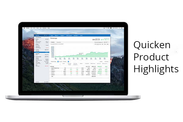
Quicken Product Highlights December 2020
Our Quicken team has been busy improving the look and feel of our products. This month, we present the new Add Account process in Quicken for Windows, and updates to the look and feel of Quicken for Mac to take advantage of the new Big Sur release by Apple.
Sweet sassy molassy have we got some cool things to show you this month! Do you know those super ugly Add Account windows we’ve been forcing you to look at in Quicken for Windows all these years? They’re gone. We sent them to live on a farm in Upstate New York where they can play with the sheep and the bunnies. Now the windows are beautiful, lovely, breathtaking even (and way easier to use). If an Add Account window could be a work of art, then this is a work of art! Maybe not Picasso or Matisse, but Andy Warhol would get what we were going for. He would totally get it.
Speaking of works of art, take a look at what we did on the Mac! We got rid of the title bar! That thing was useless and now it is gone! Forget having a big fat blue line at the top of the page. Nobody liked it (well it looked good when we started). We’ve relegated it to the trash heap of history and the world is better for it. Hey, take a look at the new sidebar too! It reaches clear to the top of the page. We’d make it reach to the sky if we could, but monitor technology hasn’t quite caught up with our dreams yet. The point is that macOS Big Sur is here, and we’re shooting the curl. Is there good surfing in Big Sur? We don’t know. We’re too busy making Quicken awesome.
Quicken for Windows Add Account enhancements
The Add Account feature in Quicken for Windows has been redesigned to make is easier to use. While the old Add Account process asked you to select an account type before accessing an online account, the new system has you start by selecting your financial institution, regardless of the account type. One of the reasons for this is that many people have multiple accounts with a single institution, and Quicken can use the same login to access all of the accounts you can access from the financial institution website. For example, if you use the same financial institution for your checking account, savings account, credit card, and a car loan, in most cases Quicken will find all of those accounts.
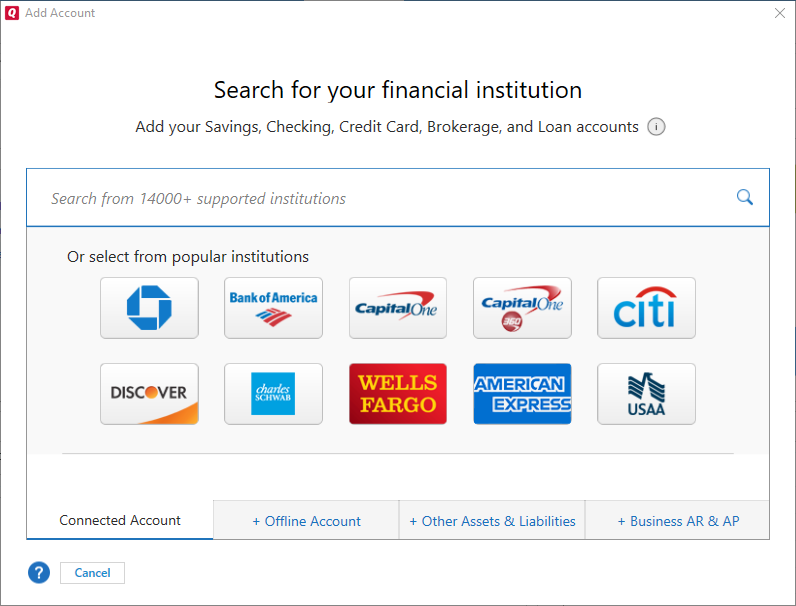
While the improved usability is the important element, we also hope you like seeing a more modern, attractive Add Account screen. We know the older version of Add Account could be a hard to look at. The type was too small and too crowded, and there was too much of it.
When it comes to adding an account, the most important step is to find the account. You can’t do much of anything until that happens. That’s why our new design takes you right in to Search. Searching for your financial institution is now the first step, with popular financial institutions represented in the buttons below.
If you’re a new user, finding your financial institution and setting up your first account is what gets you started with our product. There are other options for adding an account, but they are less common. Yes, you can add a manual account from this page, but only a few of our users prefer to do it that way, and usually only if they can’t find their financial institution. That’s why the manual options are at the bottom of the screen. Accidentally adding a manual account is a good way to have a bad experience.
Once Quicken has identified your accounts, you are presented with a screen that lets you make adjustments. For the most part, the Quicken defaults are going to be what you want. But, for example, if you don’t want to track a certain account in the register, you can change the Action from Add to Quicken to Don’t add to Quicken. You might also want to change the Nickname in Quicken to something that is more meaningful to you. Banks tend to use terrible names.
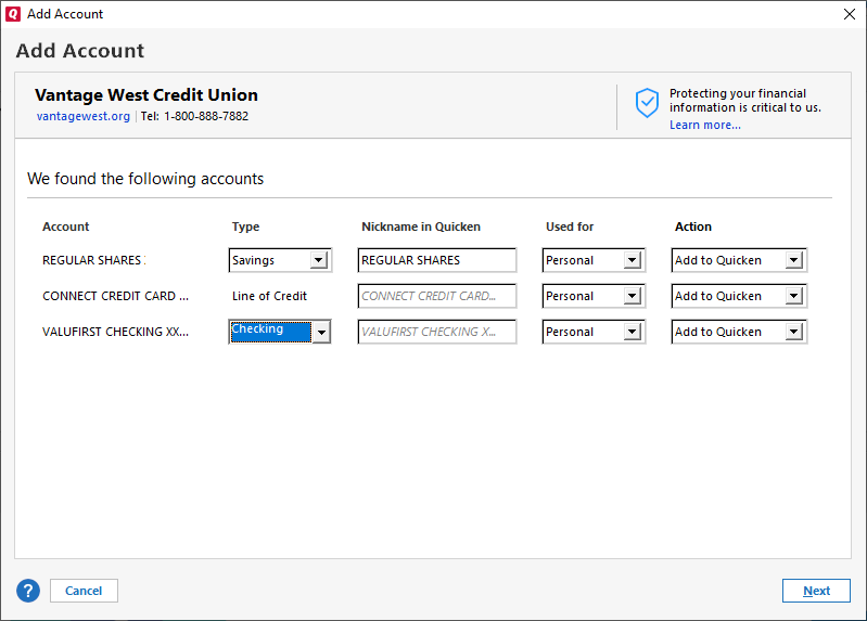
Users of Quicken Home & Business, also have the opportunity to choose whether an account is Personal, Business, or Rental.
This screen has been updated to give you a look and feel matched to the initial Add Account screen, as well as key bank information such as the bank’s customer website and phone number.
Quicken for Mac Redesign
Our Mac design team focuses on two things, making Quicken for Mac easier to use, and making it look good. The new Big Sur design guidelines form Apple gave us a chance to do both. Now you’ll see a less cluttered design (clutter is bad, ask Marie Kondo) that lets you get to what you need to do by eliminating parts of the design that don’t actually contribute to doing something. The new redesign also helps you through standardization. Whenever possible, our icons now use the standard Apple icons that can be shared across different Mac apps and Apple devices. Standardization makes things easier for you by using the same icons you’ll find in your other macOS and iOS devices.
A redesigned sidebar
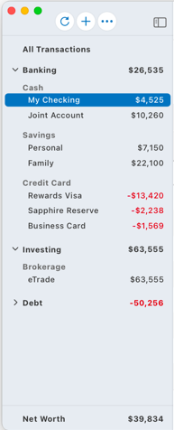
The Quicken for Mac toolbar now uses the entire left side of the panel, from top to bottom. This gives the left side of Quicken a less cluttered look that is optimized for Big Sur. We also updated the look of the buttons for One Step Update, Add Account, and Account Bar Preferences. Before, the buttons were blended into the toolbar. Now they appear in individual circles that makes them easier to find and identify.

We updated the look of the accounts to make the hierarchy more clear. Account types and individual accounts are now indented to make the sections clearer. You can expand or collapse a section using the arrows next to the section. To collapse the entire sidebar, use .
You’ll also notice that the buttons to close, minimize, and toggle full-screen view for your Quicken window have been integrated into the top left corner of the sidebar.
New tabs, no title, and an important Q
As part of our redesign, we worked to make the top tabs look more integrated into the page. The long blue bar has been updated into an off-white that better matches the content below while still providing some contrast.

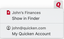
If you need to verify or change your Quicken data file, you can do that by selecting the Q menu. From there you can see your current data file as well as the email address you use to log in to Quicken.com. If you select My Quicken Account, you can access your account at Quicken.com.
Updated Icons
We’ve embraced the cleaner icons suggested by macOS Human Interface Guidelines to offer a shared experience with other other Mac, iPhone, and iPad apps. You’ll see these new icons in the register and report toolbars. These icons should be familiar to users of other common Apple applications.
In most cases, the new icons are similar to the ones we’ve used in the past, but the icons have been updated with the current standard image suggested by Apple.
Clearly drawing the line
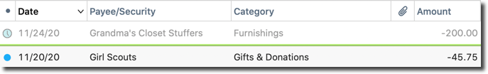
Did you know we have a line that separates transactions up to and including today, from transactions scheduled for future dates? It makes it much easier to see expenses that are coming up, such as scheduled bills. You may not have noticed the line, because it was easy to miss, especially if you highlighted the transaction next to it. We fixed that by making the line brighter, and green. It is now much easier to see.
Quicken has made the material on this blog available for informational purposes only. Use of this website constitutes agreement to our Terms of Use and Privacy Policy. Quicken does not offer advisory or brokerage services, does not recommend the purchase or sale of any particular securities or other investments, and does not offer tax advice. For any such advice, please consult a professional.


