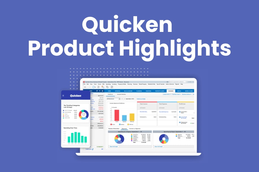
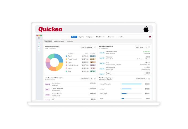
Last year, Quicken introduced its New Dashboard for the Home tab, with an improved look and feel and new cards. Since then, Quicken has been steadily making improvements to the dashboard, adding more cards, and giving some existing cards more capabilities. Quicken has introduced three new cards to the dashboard.
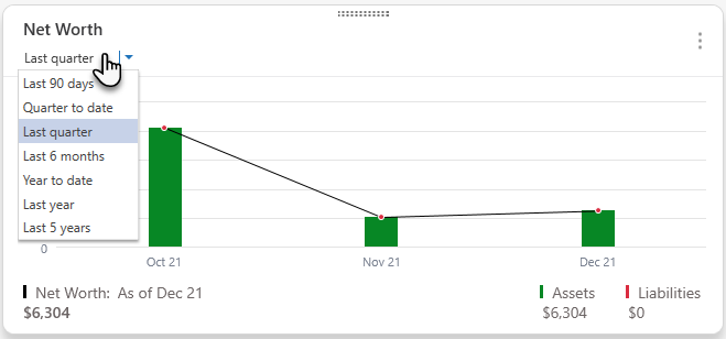
Net worth
The Net Worth card tracks your total net worth (assets minus liabilities) over time. The default is to see the last 90 days, but you can choose from many different periods up to the previous five years using the pull-down menu. Hover over an individual bar on the graph to see the exact values for that month. Select a bar for even more detail.
Bills, Income & Transfers
The new Bills, Income & Transfers card tracks your reminders for scheduled transactions. Reminders include bill payments, expected income, and planned transfers between accounts. The default view is for transactions expected in the next seven days, but you can use the pull-down menu to choose the next fourteen or thirty days. You can also choose to view all transactions or choose to see just Bills, just Income, or just Transfers. You can select the two dots on the right side of each transaction to bring up a list of actions you can take for that scheduled transaction.
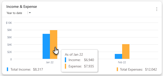
Income & Expense
The Income & Expense card lets you see your total outgoing and incoming money for a given month. The card defaults to showing the past three months, but you can select several different time frames up to the past year. You can hover over a bar on the Net Worth card to see more details. You can also select a bar to see a breakdown of your income and expenses for each period.
Additional improvements
Beyond new cards, you’ll find that dragging and dropping cards to reorder them is easier and more intuitive. We have also improved our existing cards. For example, selecting a category from the Top Spending Categories card will now send you to a list of transactions in that category. You can also click on a transaction on the Uncategorized Transactions card to bring up the Categorize Transaction screen for that transaction.
We think you will find these improvements to the New Dashboard valuable and time-saving. We will continue to add and refine the information on the New Dashboard in the coming months.
Quicken for Mac investment dashboard keeps getting better
The Quicken for Mac team has been hard at work improving the investment dashboard to provide you with better information at a glance. This includes a new toolbar, improvements to dashboard cards, and other changes.
A new investments toolbar
The new investments toolbar helps you make adjustments and updates quickly. By changing the date on the toolbar, you can review what your Holdings, Top Movers, Allocation by Security, and Allocation by Asset Class were worth in the past, from a day to a year ago.
You can select which of your investment accounts to review (or review all of them at once). Additionally, you can see when your investment values were last updated. If you want, you can update them again directly from the dashboard. You can also choose to show or hide the cents in your investment values.
Clearer Charts
We have redesigned the charts in the investing dashboard to improve clarity. Now, the charts display percentages up to two decimal places, and the background for percentages matches the corresponding color on the pie chart, making it easy to read at a glance.
Each asset class now has a permanently assigned color. For example, Cash is green.
Improved dashboard cards
We’ve made several improvements to our dashboard cards, which can now expand horizontally and vertically to match the window so you can see more information. If you work in a narrower window, the dashboard will automatically shift to using a single column with one card per row.
Holdings card
The Holdings card lists all your investment holdings along with the number of shares, the price, the value, the change percentage, and the change amount. You can now see the security name instead of the stock symbol. Also, both the Change (%) and Change ($) columns will appear if the card is wide enough to show all the text.
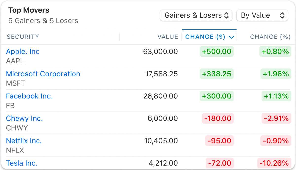
Top Movers
The Top Movers card shows the change in the value of your securities. If you own too many securities to display them all in the card, then the movers with the most significant gains or drops will appear. Click the name of any security to edit the security or see an overview of that security. Another significant improvement is that the Top Movers card now sorts Change by actual value, meaning stocks with gains will no longer mix with stocks with losses.
Allocation by Security card
Allocation by Security displays the percentage of your portfolio that each security represents. You can hover over the security name or a pie wedge to get more detailed information. We also display more pie wedges now that selecting a wedge is easier.
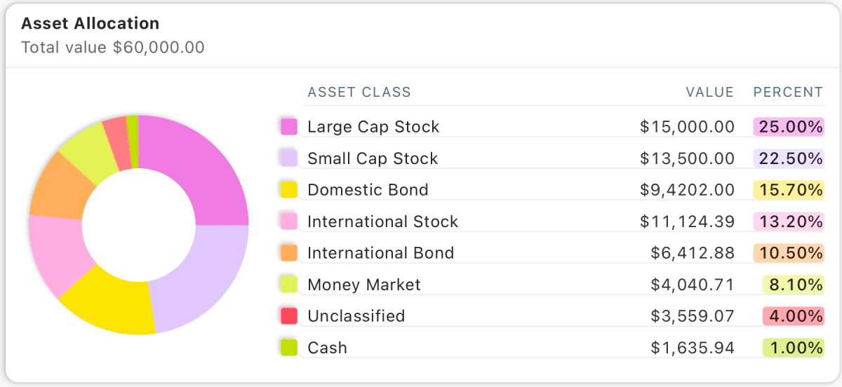
Allocation by Asset Class card
Allocation by Asset Class displays the percentage of your portfolio allocated to individual asset classes such as Large Cap, Small Cap, Domestic Bond, Cash, or Unclassified. As with the Allocation by Security card, you can hover over an asset class on the list or on the pie chart to see more information.
Quicken has made the material on this blog available for informational purposes only. Use of this website constitutes agreement to our Terms of Use and Privacy Policy. Quicken does not offer advisory or brokerage services, does not recommend the purchase or sale of any particular securities or other investments, and does not offer tax advice. For any such advice, please consult a professional.
Share article:
Post 243 of 836
About the Author
John Hewitt
John Hewitt is a Content Strategist for Quicken. He has many years of experience writing about personal finance and payment processing. In his spare time, he writes stories and poetry.


